Psychology of Design Part 1: Colour and wine labels
Each and every day we are subjected to an array of visual information to digest (consciously or otherwise). Design determines how we perceive things – and is especially pertinent when it comes to product packaging – with wine labelling being no exception! When it comes to wine, we select and drink a bottle based on direction from all five of our senses – taste, smell, touch, sight and even sound.
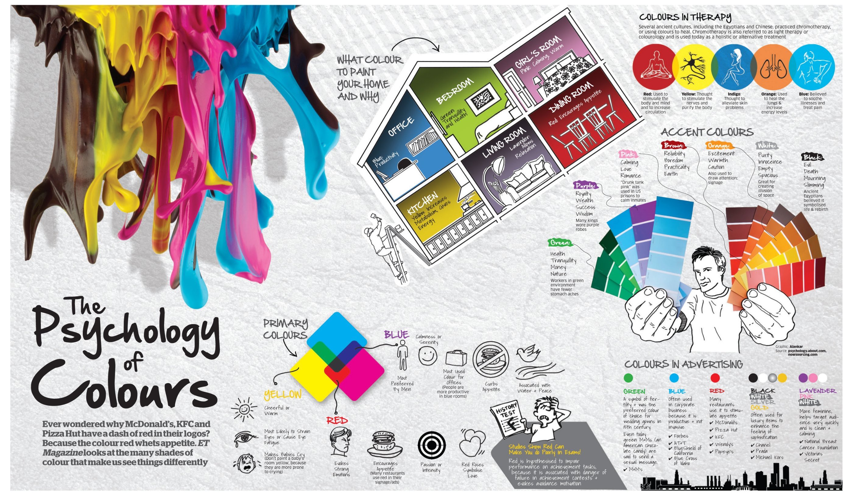
Colours are like emotions
One of the first things people notice on any kind of label is its colour. And this either encourages or deters people from finding out more about your product. It’s important to understand how different colours portray different emotions, think about your favourite wine label and the colours they use. “Colours quickly attract the eye and create assumptions in people’s minds.”
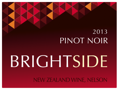
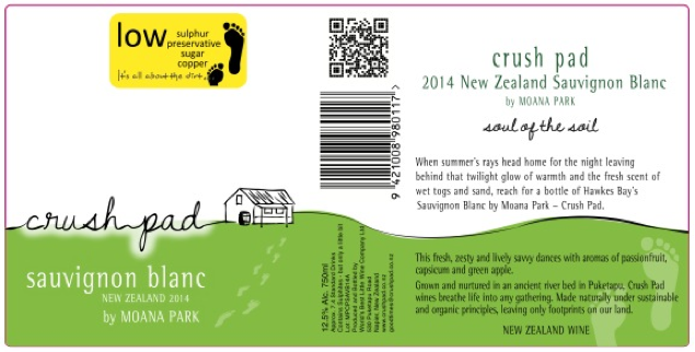
Red
Red represents power, strength, quality and prestige. It’s also one of the boldest colours, making wine labels stand out amongst the competition. It’s also the colour most aligned with impulse buying – encouraging people to purchase your wine!
Orange
Orange is often associated with playfulness, warmth and vitality due to its association with the sun and the healthy fruit of choice with the same name.
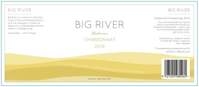
Yellow
The most cheerful colour, yellow is associated with laughter, happiness and optimism.
Green
When we think of the colour green, we almost always associate it with nature and the environment. It’s usually used to portray a product that is environmentally friendly.
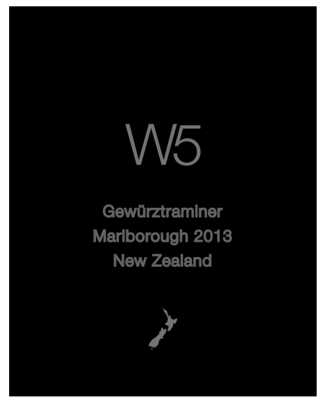
Black
The most sophisticated colour; black is usually used to illustrate value, prestige, class and high quality. It’s also associated with authority and stability – all good things for a wine label to portray!
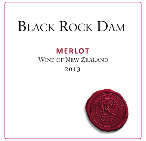
White
White represents purity, clarity and simplicity – think of a bride on her wedding day, white doves and lilies. It simultaneously creates an impression of both warmth and cleanliness. It’s also used to emphasise the absence of colour, with foreground design or wording contrasting cleanly on a white background.
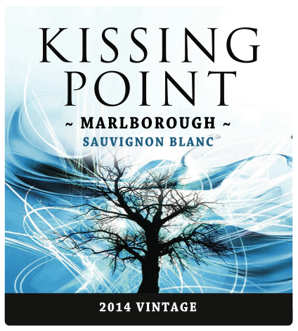
Blue
Blue is the most trustworthy, calming and reliable colour – dark blue has professional overtones while lighter blue is often associated with creativity and newness.
Combining colours for the perfect wine label
Now it’s pretty hard to create wine labels strictly using one colour, many wine labels combine more colour to create a representative design and portray a message without even saying a word!
Get in touch today for quotes for label printing.