Psychology of Design Part 2: Spacing, lines and shapes with Wine Labels
The team at Label & Litho have gone down the rabbit hole, to explore the psychology of design when it comes to wine labels. Since addressing colour, and the different emotions they evoke, we now look at spacing, lines and shapes.
There is not a lot of room on your typical wine label, so it’s important to use the space wisely – and it’s not always about filling up all the space. Negative space with minimalistic and simple designs can often create a more effective overall impression.
When less is more
“In general, people associate minimalist, uncluttered designs with high-end vintages and sophisticated flavours. More expensive labels tend to have a cream or white background with a simple logo.”– David Schuemann, 99 Bottles of Wine
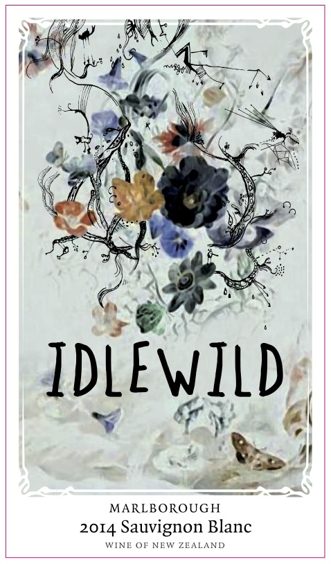
When more is merrier
When targeting less experienced palettes, it’s often the complete opposite to the minimal tactic used to target oenophiles. For these customers, the bottle needs to ‘jump’ off the shelf. It’s about a quirky design rather than the reputation of a winery’s name.
Not just the label
Although the label is arguably the most important feature on a wine bottle, wineries also focus on the shape of the bottle. The shape of the wine bottle can have a profound effect on the sale of the wine. If consumers can be persuaded to pick up a product, it’s more likely they will purchase that product.
What about that cap at the top? Some are in block colours, others feature fine lines or subtle sparkles. It shows that care has been taken to even the smallest of details, and the wine is therefore perceived to be of higher quality.
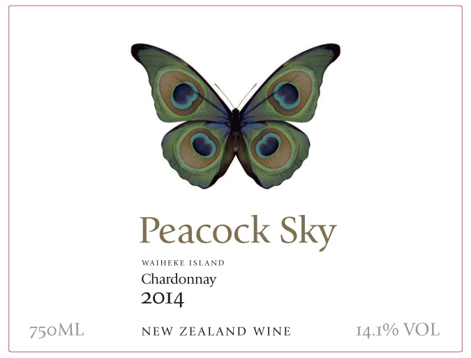
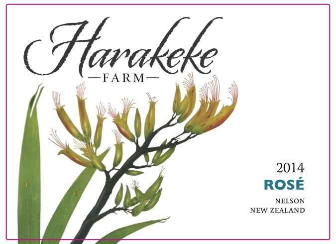
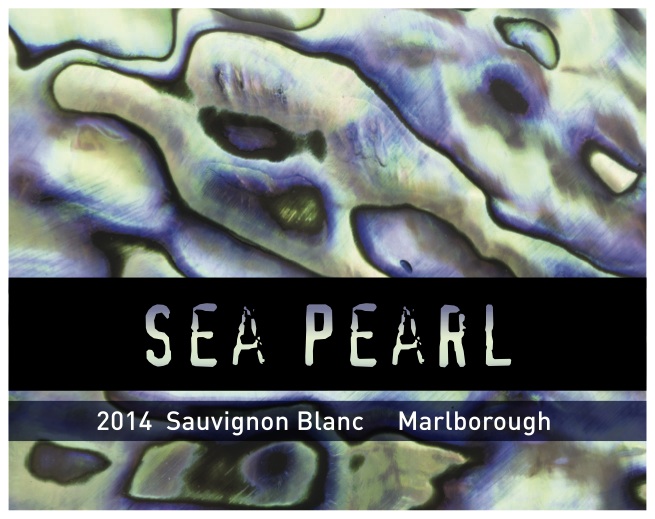
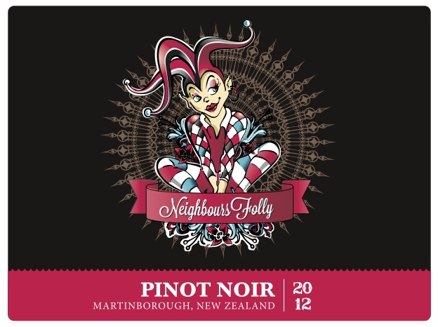
Take a look at some the wine labels we have printed recently here and if you are interested in getting wine labels printed get in touch today.